Workshop Recap for Prune Your Photos (2026)

Thank you again to everyone who joined me for the Prune Your Photos workshop. I truly enjoyed working through your images together, and I want to make sure you walk away with more than a memory of a good Zoom call. This recap is designed to be something you can return to the next time you're staring at forty-seven nearly identical shots of the same rosebush, wondering which one deserves to survive the edit.
Because that's really what pruning is. And if you're a gardener, you already know this: pruning isn't always about getting rid of something bad. It's about deciding what gets to keep growing.
Why Pruning Matters Before How
Before we ever touched a crop tool or a saturation slider, we started with a question that sounds simple and isn't: What is this photo about?
Not "what's in the photo." What is it about.
A picture of holly berries in the snow might be about the berries. Or it might be about the tension between warmth and cold. Or it might be about the way your eye hunts through branches to find that hidden cluster of red.
Every editing decision flows from that question. Cropping, color, orientation... all of it is in service to the story you've decided the photo is telling. If you don't know the story, the tools can help you find it. Even a simple crop can transform what your audience feels when they study your photo.
Watch the whole workshop on my YouTube.
The Three Questions
We organized the workshop around three questions that work in sequence. Think of them as the same three cuts a good gardener makes: what stays? what shape does it take? and what does it need to thrive?
Which photo do I keep? When you've shot a burst or a series of nearly identical images, start by letting your eyes go loose. Don't force yourself to look anywhere specific. Just glance at each photo and notice where your eye lands. That's what the photo is "about", whether you planned it that way or not. Then compare two versions side by side. Even a half-inch shift in camera position can make a striking difference in focus, distortion, and how your subject sits in the frame.
And notice what itches. If something about a photo feels slightly wrong but you can't name it, perhaps a tilted background line, a dark corner pulling your attention, an intruding branch, that's your eye catching a composition problem before your brain has the words for it.
How should I crop it? Cropping after the fact is one of the most powerful and most underused tools you have. We spent a good part of our time together discovering that a single image can tell completely different stories depending on how you frame it. Crop in tight and you get a single detail, a captured moment, a visual poem. Pull wide and you get a landscape painting with context, scene, and atmosphere.
We saw this vividly with shots where a vertical photo became something entirely new as a square crop. We saw it with the holly berries, where pulling in just slightly to remove a few background elements made the subject pop without losing the feeling of searching through the branches.
Don't forget that changing orientation changes the story. Vertical, horizontal, and square are not interchangeable. And rotating even slightly off-level can evoke motion or wonder or a drunken lean, all of which can be useful when you want emotion over documentary accuracy.
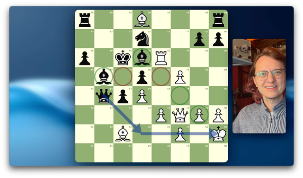
What tonal adjustments does it need? This is where restraint matters most. We explored a few tools that can close the gap between what you saw and what the camera captured, but the key principle is: composition first, editing second. Aim for about 70% of your vision in-camera, then crop and tweak to close the gap. Not the other way around.
The Rule of Thirds: Your Constant Companion
If you take one tool home from this workshop, let it be the Rule of Thirds grid. Two horizontal lines, two vertical lines, nine boxes. The four intersection points are where eyes naturally gravitate, and placing your subject at or near one of those crossings creates a more dynamic image than dead-center placement almost every time.
But the grid is more than four dots. The lines themselves matter. Leading lines in your scene (such as branches, stems, shadows, or water edges) can pull the viewer's eye in a direction. When those lines are intentional, they guide the viewer to your subject. When they're accidental, they drag the viewer away. Spirals, triangles, and diagonal paths between intersection points are all variations on the same idea: giving the eye somewhere meaningful to travel.
If you haven't already, turn on the grid overlay in your iPhone camera settings (Settings → Camera → Grid). It will change how you think about every shot before you take it.
What We Learned by Editing Together
Some of the richest moments in our session came from working through your submitted photos. A few highlights worth remembering:
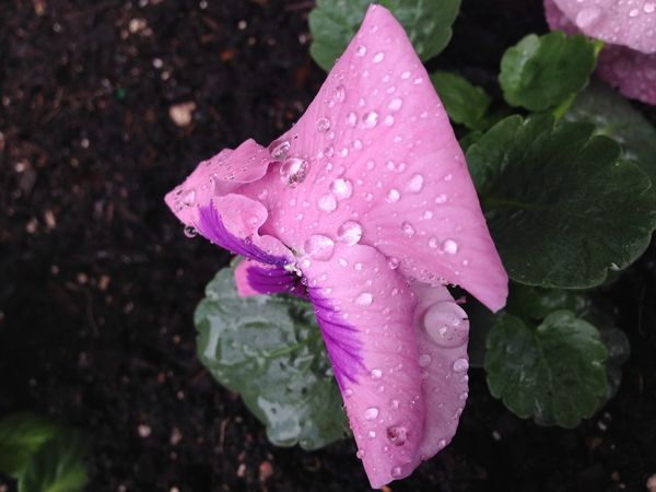
Negative space is a story decision. We used a snowy holly shot to see this clearly. The snow masked the background and created breathing room around the subject. But a dark shadow stopped the eye, creating tension between too empty and too busy. Negative space isn't just "empty area." It's the silence between notes in a piece of music.
Layering gives a photo depth. A well-composed image has a foreground, a focal point in the middle ground, and a background that supports without competing. We saw this beautifully in the dock photo, where layers stacked from the grass at our feet to the boat on the water to the trees and sky beyond. Think of your layers as projector transparencies, with each one visible through the others, each one doing its own work.
Black and white is a diagnostic tool. When you strip color out of an image, you can suddenly evaluate composition, tone, and texture without being distracted by a pop of electric pink or that one impossibly green sweater in the background. Try cropping in black and white, then reintroduce color once you've dialed in your composition. It's a small trick that changes everything.
Background removal is harder than it looks. Unless you're skilled in Photoshop or Pixelmator, the best strategy is to blur the background while taking the photo (Portrait Mode or low aperture) not try to remove it afterward. AI-automated background removal creates artifacting, those fuzzy, unrealistic edges especially visible around hair and complex plant details. A slight 12% blur in post can look natural if you mask carefully, but a full background removal rarely is your best path.
Quick Reference: Your Editing Checklist
The next time you sit down to prune your photos, run through these in order:
Before you shoot
Decide on your subject. Turn on the grid. Think about where your subject will fall on the Rule of Thirds. Consider whether you want a tight poem or a wide landscape painting.
Choosing between shots
Let your eyes go loose. Compare side by side. Trust the itch. Ask: is this the right subject in the right place?
Cropping
Remove distractions at the edges. Try different orientations. Remember that cropping in tight changes the emotional register of the image entirely.
Color and tone
Use the saturation slider to evaluate whether you even like the color, or whether composition is the real issue. Try the clarity slider for hazy shots, but don't overdo it on fine textures like pollen. Adjust contrast and black point together for richer depth. Drop highlights to recover blown-out whites, but know it affects every light-colored element in the frame.
The 70% rule
Strong composition is creative. Editing is corrective. Do the seeing before you do the fixing.
Glossary
A handful of terms worth keeping close. These showed up in our conversation and will show up again.
Aperture (f-stop)
The size of the lens opening. Low number (f/1.8) means wide open, shallow depth of field, blurry background. High number (f/16) means small opening, deep depth of field, everything in focus. On iPhone, Portrait Mode simulates low aperture.
Bokeh
The aesthetic blur in out-of-focus areas. Those soft circles around light sources in the background of a portrait? That's bokeh. Produced naturally by low aperture or simulated by software.
Composition
The deliberate arrangement of everything in your frame: subject placement, leading lines, negative space, layers, and balance. The foundation of a photo, separate from any technical settings.
Depth of Field
The range of distance that appears sharp. Shallow means only a narrow band is in focus. Deep means most of the scene is sharp.
Leading Lines
Lines that guide the viewer's eye through the frame and toward the subject, away from it, or in a spiral. Branches, paths, shadows, fences, water edges.
Negative Space
The empty or out-of-focus area around your subject. It creates breathing room and focuses attention. Too little feels crowded and too much feels disconnected.
Rule of Thirds
The 3×3 grid. Four intersection points. The most useful compositional tool you'll ever learn.
Selective Color
A feature in some editors that lets you boost or reduce the saturation of a single color channel (red, blue, or green). Powerful, but be careful not to accidentally desaturate that grandkid's sweater.
What's Next
In our next workshop, we're going to practice rating photos. You'll get a rubric—a set of specific criteria—and a collection of images, and you'll break them down element by element. If you'd like to submit photos for the group to rate anonymously, please send them in early so I have time to prepare them.
This is where seeing starts to sharpen into skill.
If any terms from today's session (or from your own reading) still feel unclear, send me a message or leave a comment below. I'll make sure definitions appear in either a follow-up email or our next session materials.
And in the meantime: pick up your camera. Go take pictures. Think about where you want your audience's eye to land before you press the shutter. Try one deliberate crop this week. See what story emerges when you let the frame do the talking.
The garden is always growing. So is the eye that learns to see it.
Questions? Reach me at andrew@alinke.com or leave a comment below.